The Artwork of Katy Stone

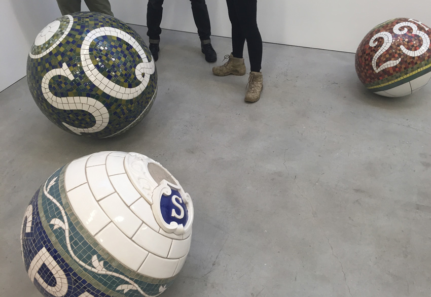
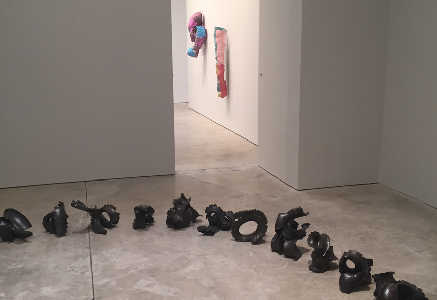
Katy Stone is an American artist whose work I showed during my time as a gallery director and it really was the most unique and sold very well. She was also one of the most creative, ambitious and thoughtful people I ever worked with. It's been a delight to follow her work over the years. I'm late in posting this, but back in May she had a show at Mary Ryan Gallery in Chelsea and showed her newest body of work. She's producing her beautiful, sinuous works out of laser cut aluminum that's painted with automotive paint and assembled. They're durable, light-weight and just gorgeous. 

You can enjoy more of her work here.

Manus x Machina

The Manus x Machina exhibit at the Met is truly stunning. It explores the convergence of the man-made vs machine made and includes garments from a wide array of years from the Victorian era to now. Some are traditional and elegant, while others are haunting, but each is worth some time to examine and appreciate the creativity and craft that went into them. Below are a just a few examples. The exhibit is up until September 5th. 

Above left is a detail of "Coat" from 2014 by Valentino S.P.A (Italian, founded 1959).Above right is a detail of "Evening Dress" from 1963 by House of Givenchy (French, founded 1952).

Above left is a detail of "Coat" from 2014 by Valentino S.P.A (Italian, founded 1959).
Above right is a detail of "Evening Dress" from 1963 by House of Givenchy (French, founded 1952).

Above left is "Bahai" Dress from 2014 by Threesafour (American, founded 2005). Above right is Evening Dress from 1965 by House of Balenciaga.

Above left is "Bahai" Dress from 2014 by Threesafour (American, founded 2005). 
Above right is Evening Dress from 1965 by House of Balenciaga.

Above left is "Cape" from 2015-16by Comme des Garcons (Japanese, founded 1969). Above right is "Coat" ca. 1919 by Paul Poiret (French, 1879-1944). 

Above left is "Cape" from 2015-16by Comme des Garcons (Japanese, founded 1969). 
Above right is "Coat" ca. 1919 by Paul Poiret (French, 1879-1944). 


Metropolitan Museum of Art: Pergamon and the Hellenistic Kingdoms of the Ancient World

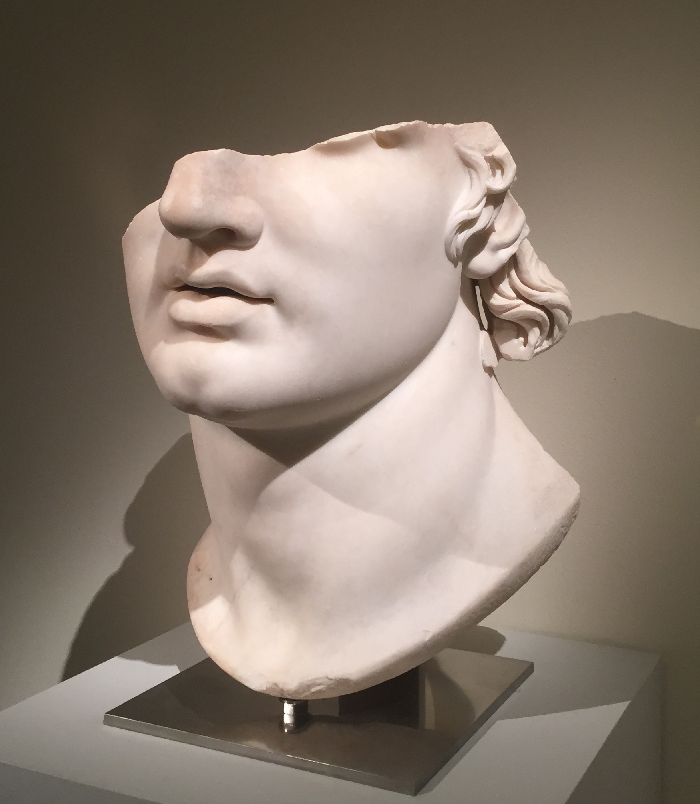
There's a lot happening at the Met right now and it's worth the time to investigate. On the second floor there's a beautiful, comprehensive exhibition curated by Carlos Picón of sculpture, mosaic and jewelry from the Hellenistic Kingdoms that existed in the region surrounding present day Greece. The piece below is the "poster" image for the show, but for good reason. It's far larger than life and is a masterful sculpture that is making its debut in the United States. To me there's always something interesting about a sculpture that has a section chopped off. It draws your eye to areas you may have otherwise missed. I wonder where the rest of it went. 

DECO DESIGN IN LOWER MANHATTAN

I recently went into the lobby of 90 Broad Street in the Financial District of Manhattan because the entry was so beautifully designed I couldn't help myself. The guard was very kind to explain some of the history of the building and what transpired there when Hurricane Sandy hit. 

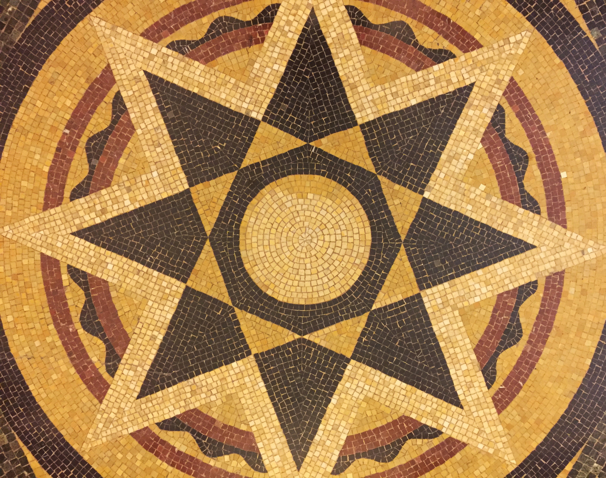
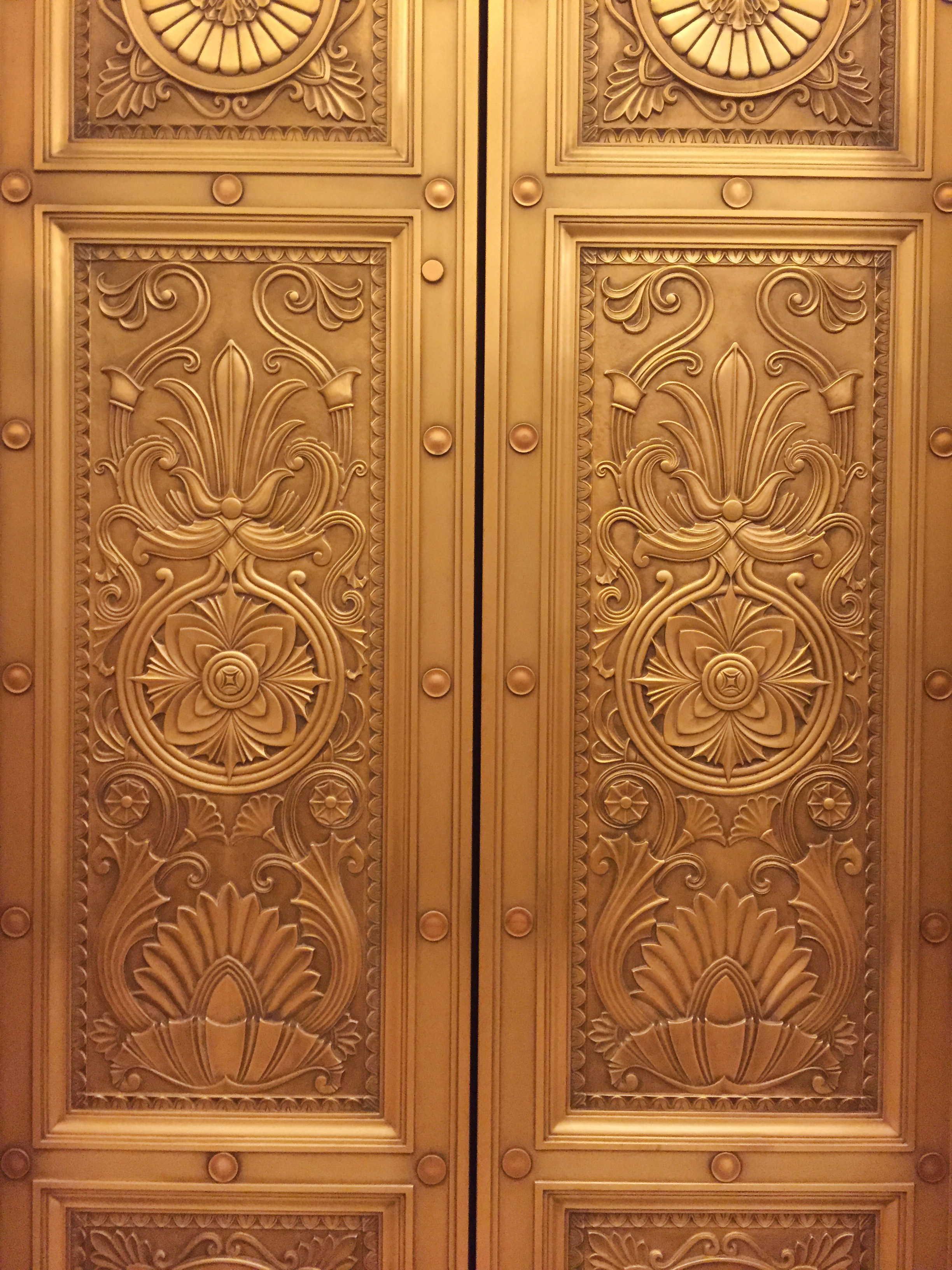
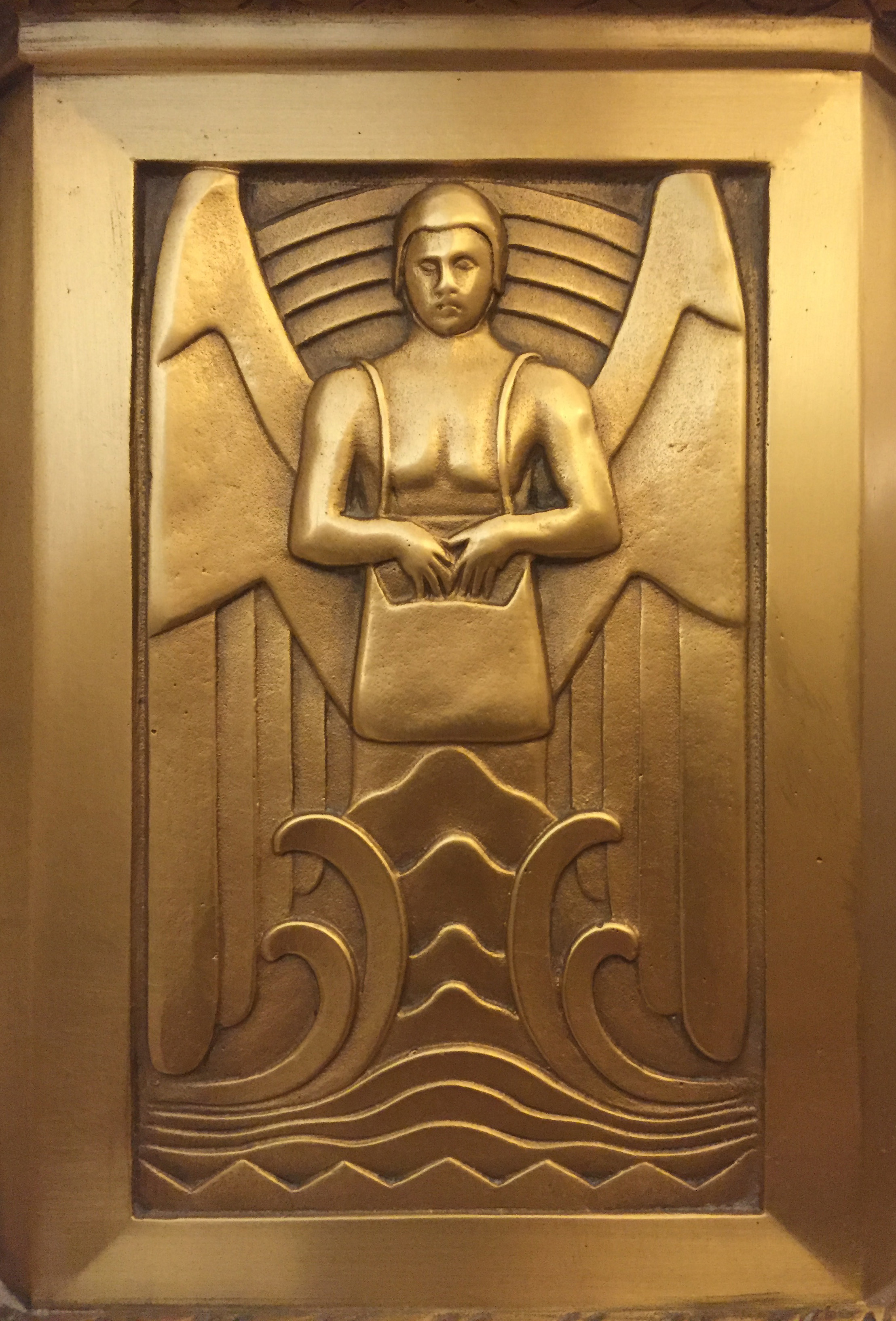
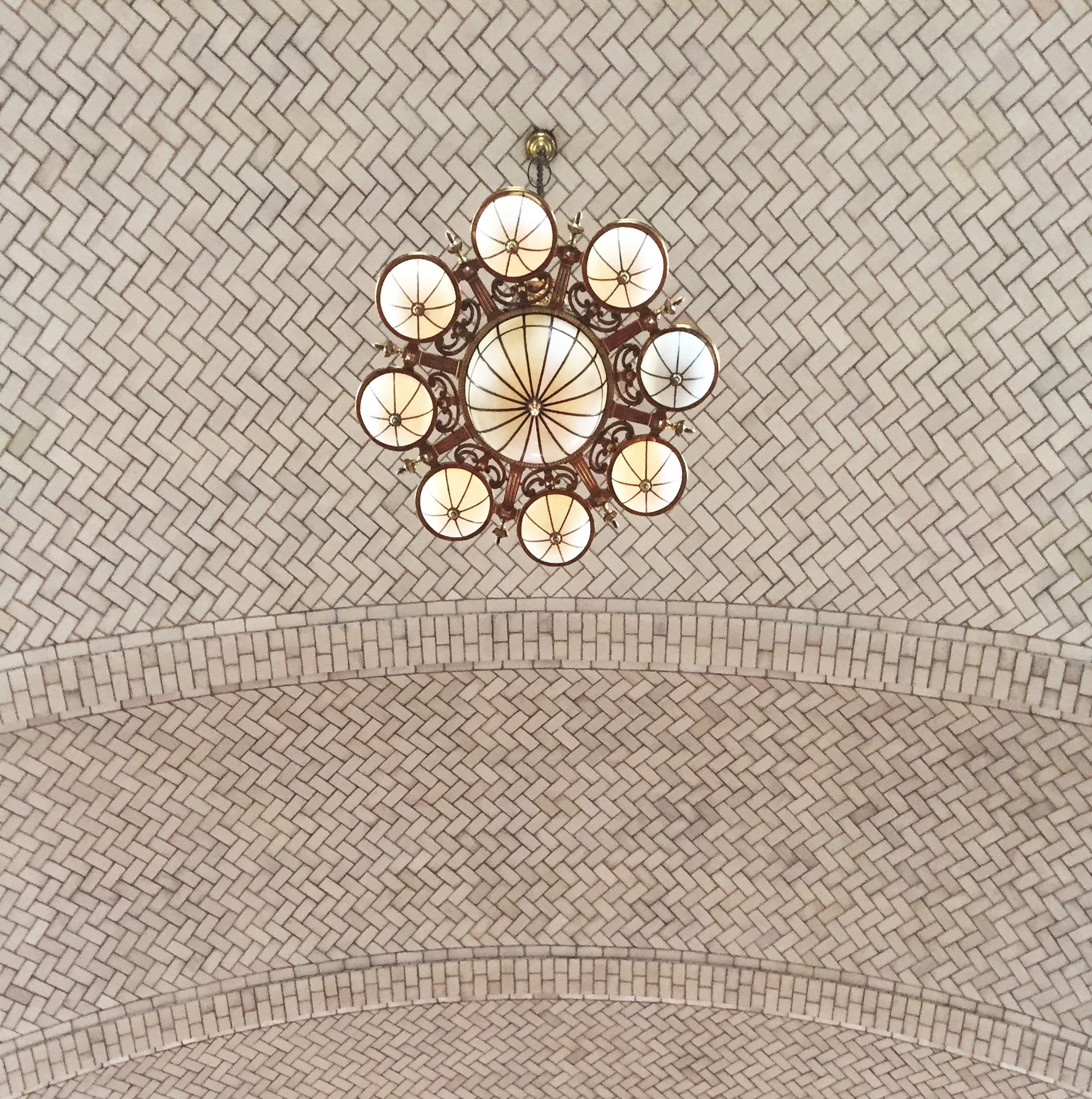
The building was designed by the firm of Cross & Cross (a father and son) and was completed in 1931 as the Stone and Webster Building. It is currently known as just 90 Broad Street. The architects were perhaps most known for their design of the the incredible General Electric Building on Lexington, completed the same year and the Tiffany store on 57th and 5th Avenue. The lobby exhibits a cross-section of art deco and classic designs in a somewhat restrained aesthetic for the day. Below are some details of the mosaic floor, beautiful elevator doors, a panel of the mail chute and the coffered ceiling, which was not damaged by the hurricane. 

GIANT BUNNIES

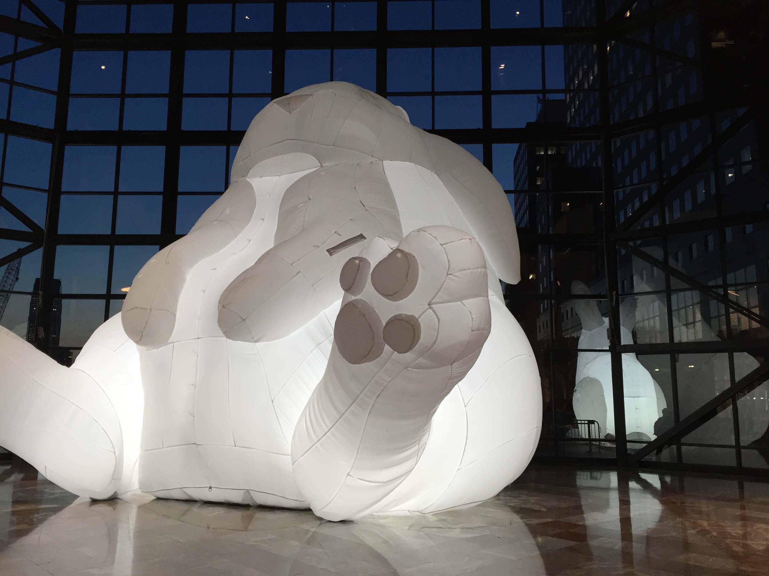
The Australian artist, Amanda Parer, created a mamoth installation titled "Intrude" at Brookfield Place in Battery Park City in Lower Manhattan last month. There were 7 rabbits that measured as much as two-stories in height, the largest being about 39 feet tall. They were made of white nylon and are inflatable. Even at that scale they're still cute! Apparently they've been traveling (hopping?) around the country. So glad I got to see them. 

TILES OF ELLIS ISLAND

I went out to Ellis Island this weekend when my family was visiting. I've been before and am always in love with the tiles. The building was designed by the architects Boring and Tilton and processed 17 million people from 1892 to 1954. The ceiling of the great hall was done by the immigrant founder of a very successful tile company, Rafael Guastavino. The layering of tiles produced a very strong, arched surface, which can be seen in buildings throughout the United States including the City Hall subway station, the Municipal Building, the Queensboro Bridge arcade, the Biltmore Estate, Grant's Tomb and many others. 

Also throughout the main building are subtle decorate mosaic elements that surround terrazzo floors, an ancient Venetian invention that uses crushed stone set into concrete and polished. 

Vibrant Mexico

I spent some of December in Mexico City getting ideas for design projects I've been doing in Mexico recently. The city was phenomenal. One of the most noticeable things was the amount of vibrant color you see in every direction. Buildings are painted with shades we probably don't sell at Benjamin Moore and fabrics, baskets, gifts and even the Christmas trees were dyed bright colors. I'm not sure where that originated, but I suspect perhaps the earth provided more natural pigments in Mexico and Central America than in other places. But perhaps it's because the people themselves are so vibrant. Whatever the reason, it was truly inspiring. Below are just a few of the photos that demonstrate the color saturation you just don't see anywhere else. 

Touring an artist's studio

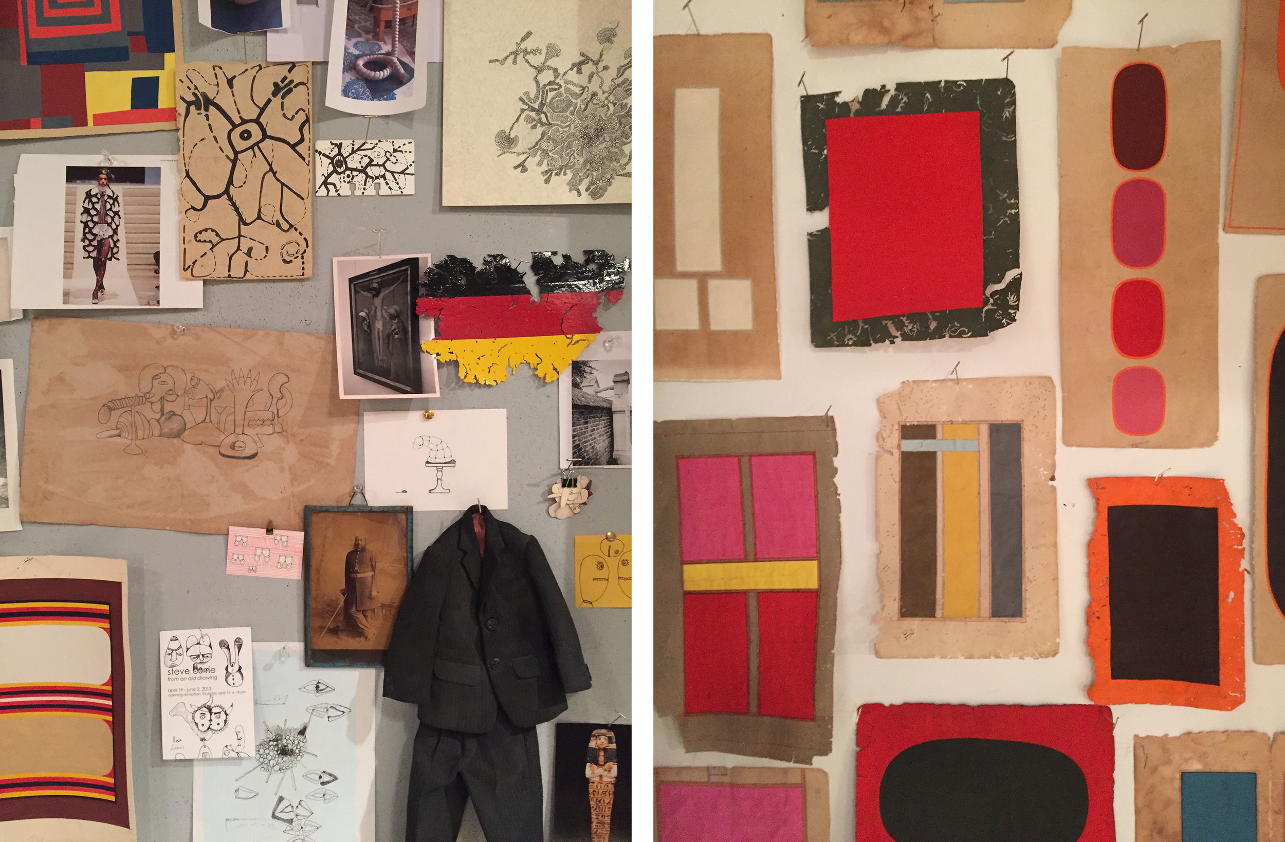
I recently attended a sale of historic Indian drawings from the private collection of British artist Alexander Gorlizki after seeing a post on instagram about it. He had been collecting detailed drawings from India for decades and was trying to thin out the immense collection. I didn't know what to expect and surprisingly was unfamiliar with the artist, despite his representation by a major gallery. The Dumbo studio was filled with all sorts of interesting and inspirational objects and he was a very interesting man to talk to. The space was truly mesmerizing. Below is a shot of some of the oddities he has tacked to the wall and at right is a new series of work that he's developing that I am absolutely in love with. Such striking colors, bold shapes and the interplay between the contemporary look and the original, vintage paper/artwork that he's actually using as his canvas is really stunning. I can't wait to see the full body of work unveiled. For more of his work, check out:  http://www.gorlizki.com/

alexandergorlizki

Anthony Pearson at Marianne Boesky Gallery

I recently had the pleasure of seeing the work of artist Anthony Pearson at Marianne Boesky. Many of his works are carved plaster with coloring added to make them look like charcoal. These were less appealing to me, but the works composed of pure plaster (hydrocal) in a simple walnut frame are absolutely stunning. Attached is an example. There's a natural, almost accidental formation, which is of course not accidental at all, but creates depth and the play of light and shadow that make these pieces a contrast of delicate and heavy, free yet contained and overall very sensual. This piece is titled: Untitled (Plaster Positive), 2015, Hydrocal in walnut frame, 48 3/4 x 37 x 3 1/4 inches123.8 x 94 x 8.3 cm

Revisiting Watercolor

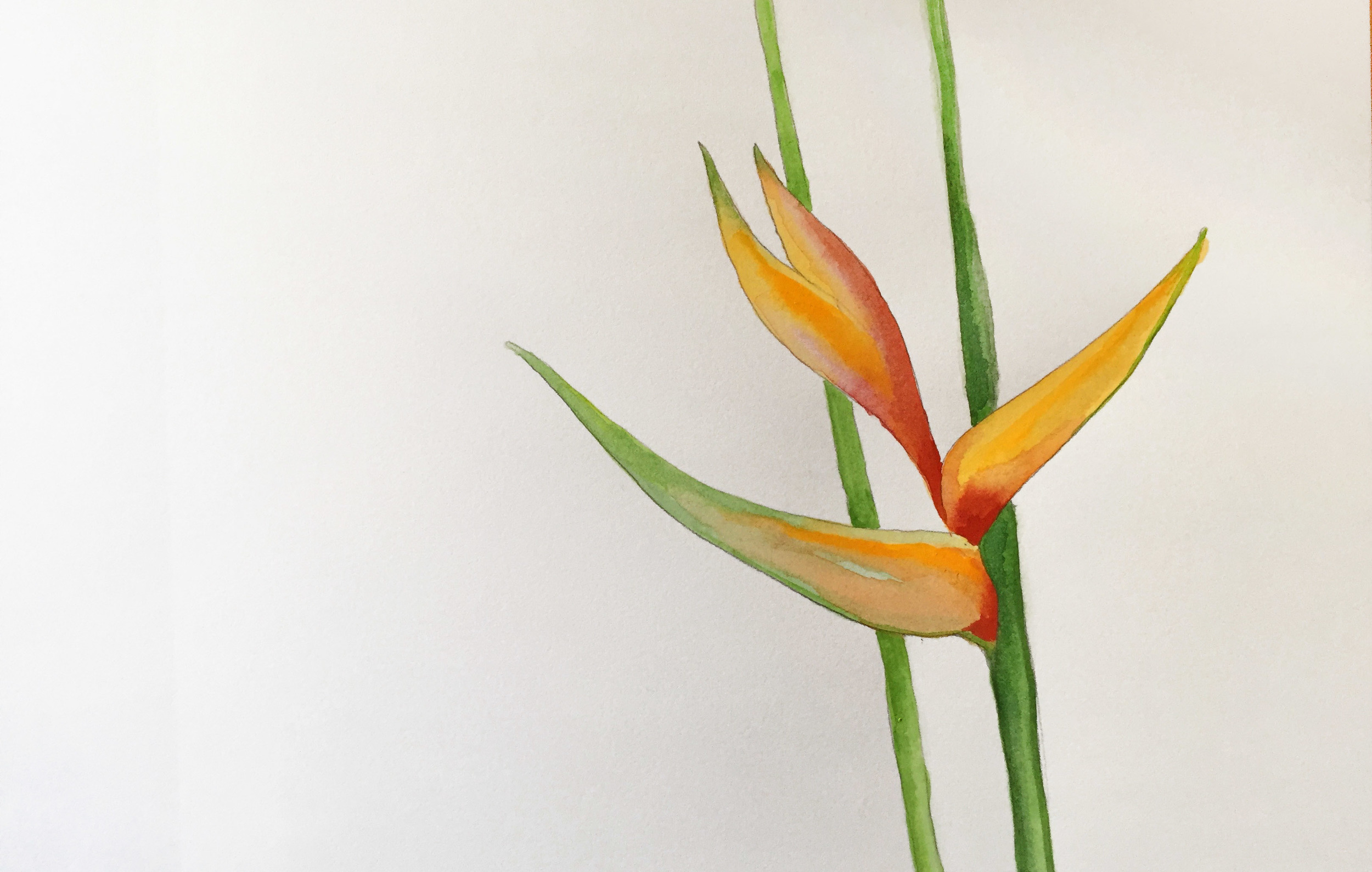
It had been many years since I picked up a paint brush, but I'm currently working on the design of a number of materials for a corporate incentive trip to Hawaii. I decided I would try a different approach that didn't incorporate stock photography or illustration and make something entirely unique to the project. This was the first attempt at a watercolor. I was pretty happy with the result and just thought I'd share. 

Zhang Huan at Pace

One of the most interesting exhibits I've seen in a while is that of Chinese artist Zhang Huan, which is on view at Pace Gallery in Chelsea through December 5, 2015. The exhibit is composed of two uniquely different sections. There is a haunting, absolutely vast painting of soldiers titled June 15, 1964. It includes over 10,000 of them and measures 122 feet long. This is installed in the main gallery space. The side two rooms are filled with his subtle and intriguing new works called "Ash Paintings" that are paintings in a semi-traditional sense, but incorporate a three-dimensional representation of braille. To not-braille readers they just appear to be beautiful textures, but they also say something. They also include ash as the pigment and are a range of soft gray tones. They're simply beautiful. Below is a detail of one. I highly recommend seeing this exhibit. 

Theater Opulence

I just had the memorable experience of attending the very last concert of Buena Vista Social Club ever to be held in the United States. Part of what made it memorable was the beautiful combination of vocals, brass and percussion that captures the romance of salsa dance in a timeless, classic way, but also the venue itself - the historic Beacon Theater on Manhattan's Upper West Side. The theater was the older sister to Radio City and opened in 1929. It was designated to the National Register of Historic Places in 1979 and has been lovingly cared for and restored over the years. The gilding and painted murals are worth a visit. There is something to see from every angle.

Frank Stella's bold use of color.

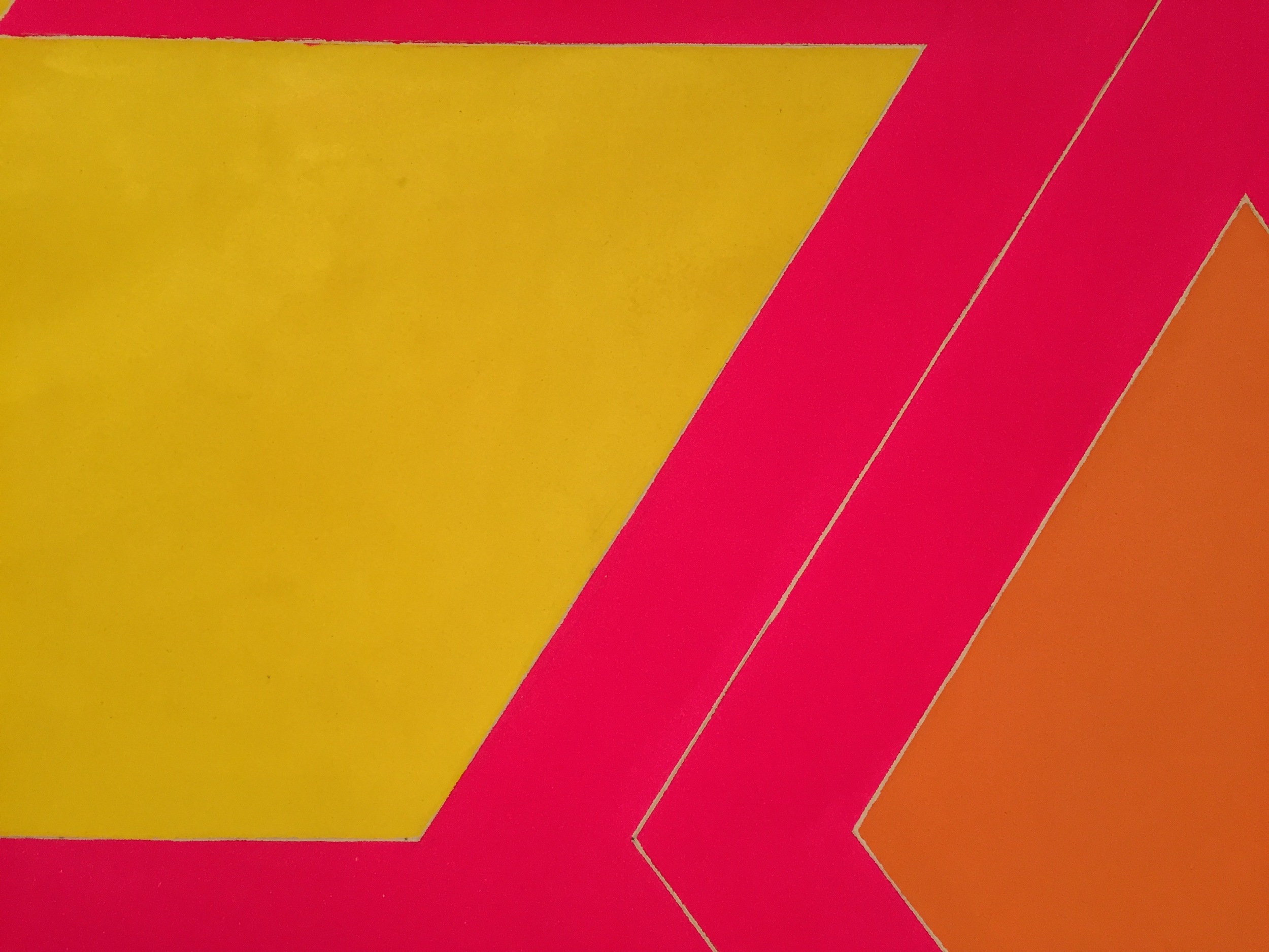
Last week the Frank Stella retrospective opened at the Whitney. To be honest, his work has never been my favorite, but certain pieces stand out to me. Typically they're the quieter, black and white ones, but there was a piece ( Effingham II, 1966. Acrylic on canvas. 127 1/2 × 132 × 4 in.) in the show that used the most intensely vibrant colors that surely raise your heart rate, but cause a reaction for that reason. Below is a detail. I found it invigorating. What do you think? 

Carving at CUNY

There was a lecture at the CUNY Graduate Center on 34th Street last week about the New Amsterdam colony. It was a fun crossroads of family history for me because the building (CUNY) was originally the B. Altman department store, which was constructed in 1904/05 and was the reason my Italian family came to this country. They were stone and wood carvers as well as decorate plasterers, trained in Northern Italy. Most of this building was gutted, but the lobby retains its original detail, which I suspect was carved by my ancestors. It was a pleasure to see. And the lecture was great too. 


Art Deco Amazingness.

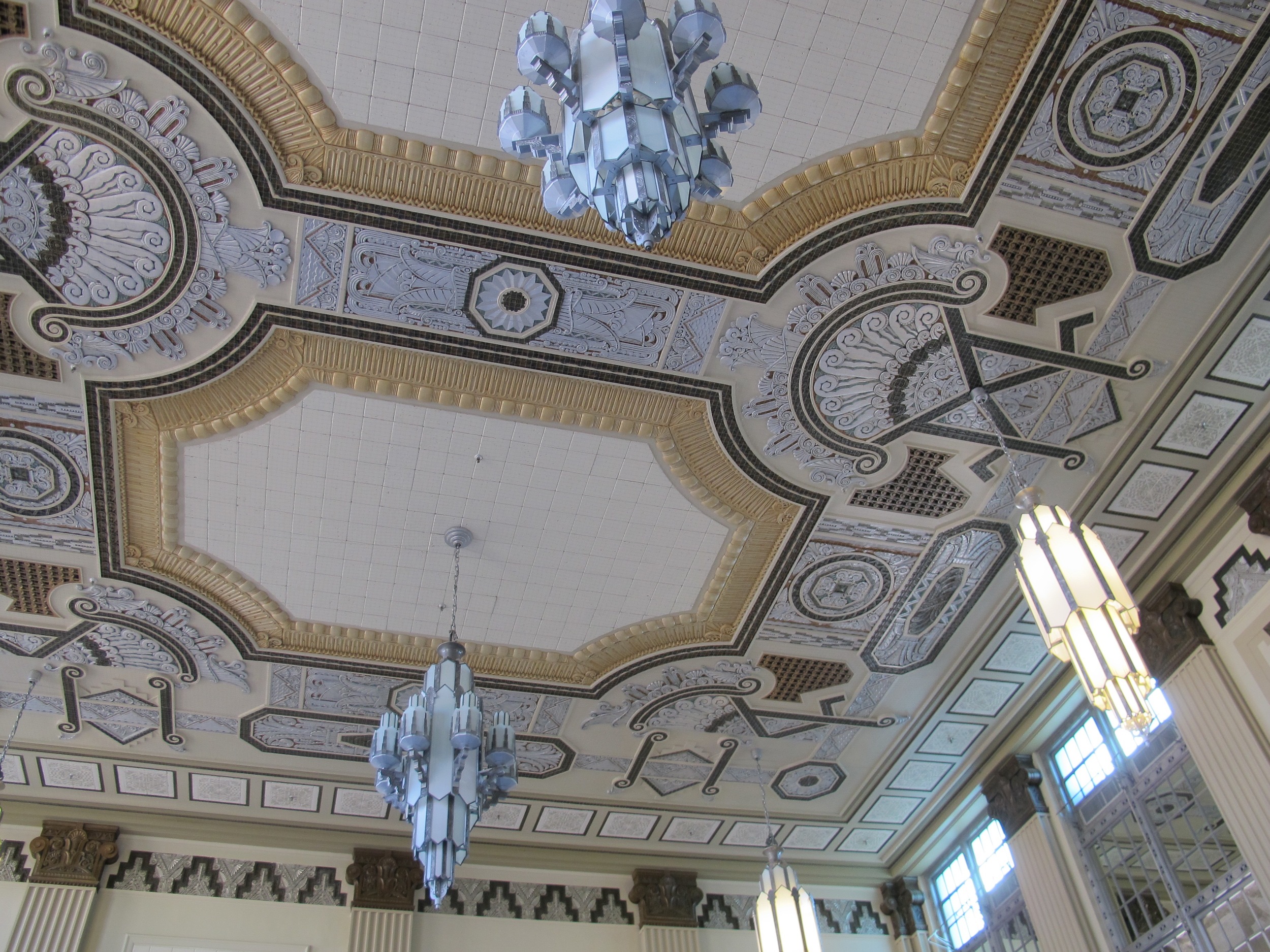
Check out the ceiling of the Texas & Pacific train station in Fort Worth, Texas. Isn't it incredible? It's like stepping into the 1930s with every detail having been lovingly restored. The station is located at 1600 Throckmorton Street. It opened in October, 1931. It was closed in 1967 and lay unused for decades until it was restored to its former beauty in 1999. Passenger service resumed in 2001. What a national treasure. 

Colorful Window Displays in Dallas

Hey there. Just returned from Dallas where we attended some art events and museums. Along the way we passed these attention-grabbing window displays at Niemann Marcus. The lighting helps to accentuate the color. Aren't they fun?